Before I start diving into this article, all you experienced traders out there can skip this one as I will be covering the basics of how to analyze a stock chart.
So, now that we have addressed the elitist – why use charts? For me it’s about being able to quantify and qualify potential trading opportunities. You can also try to perform this same function by looking at news events, trading boards, earnings report, etc.; however, charts provide you a clear view of the law of supply and demand in a graphical format.
While there are still a handful of traders that utilize fundamentals, the bulk of hedge fund managers and active traders use charts. So, the old adage applies, if you can’t beat them, join them.
The standard Structure of a Stock Chart
A stock chart will consist of a number of key components (listed below) which I will detail throughout this article:
- Chart Type
- Time Scale or X-Axis
- Price Scale or Y-Axis
- On-Chart Indicators
- Off-Chart Indicators
- Timeframes
- Drawing Tools
Depending on your software of choice, this list can expand but in general these are the main focus areas of value.
Chart Type
There are a number of methods for plotting price data on a chart. Below are the most popular:
- Line
- Candlestick (Most Popular)
- Point and Figure
- Open, Low, High, Close
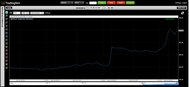
Line Chart
A line chart is the most basic of the plotting methods listed above. A line chart has one data point for each day or period of time which is the closing price for the respective time period. While this creates a simplistic view of the market, you miss out on so much valuable data, that over time using line charts will prove challenging when competing against other traders.
Candlestick Chart
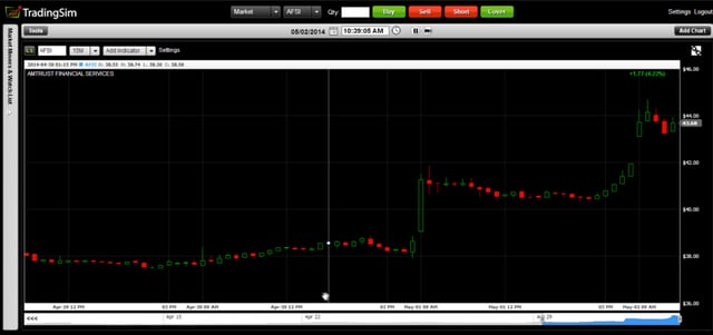
Candlestick charts are by far the most popular charting technique in the market. If you read other trading blogs or look at screenshots of traders’ computers on the web, you will notice this charting style the most.
Candlestick charts allow the trader to quickly see the high, low and close of the stock, but it also has the concept of the body. The body represents how the stock closed relative to its open and is colored green for up days and down for red days. The ability to show this level of price action is what makes candlesticks so popular.
Point and Figure
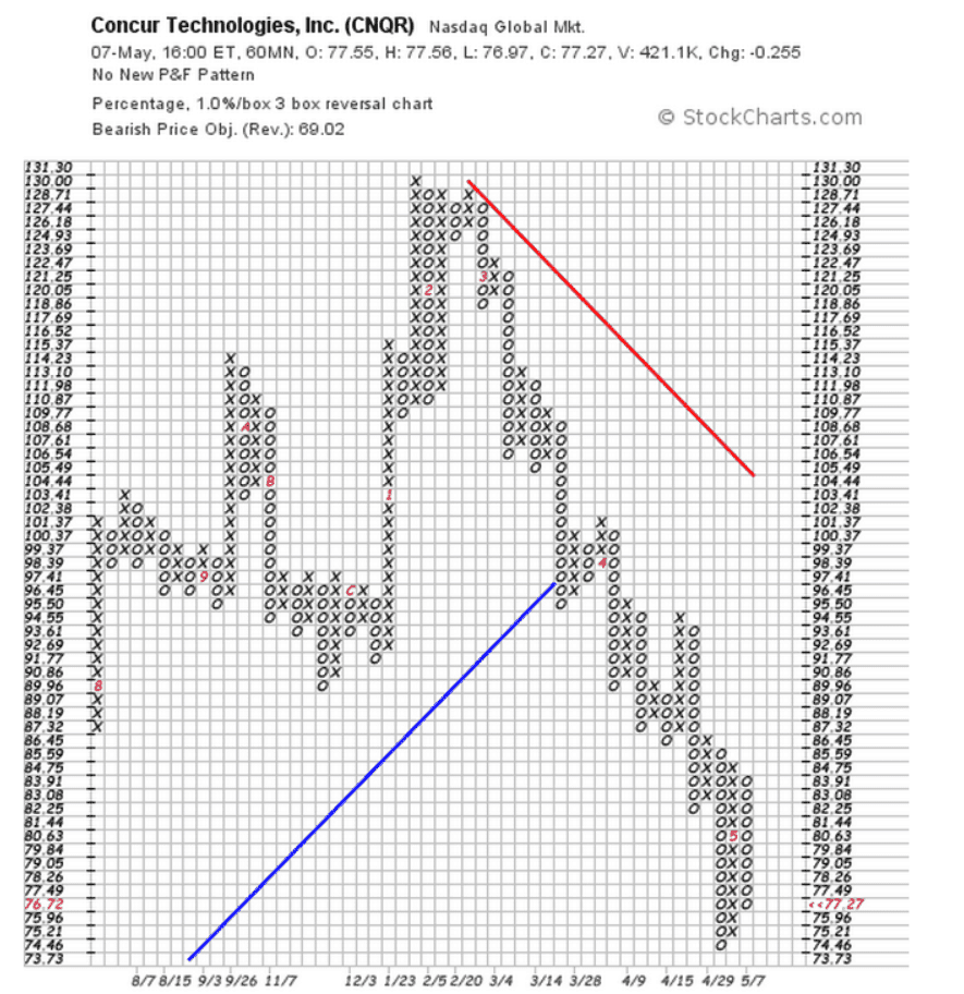
Point and figure is not widely used in today’s trading circles, but for me point and figure charts was the key to letting my winners run. Instead of the chart action being based on time, point and figure charts are based on the percentage movement of price. This allows you to remove the element of market noise and zone in on the “true” intentions of the smart money.
Open, High, Low, Close (OHLC)
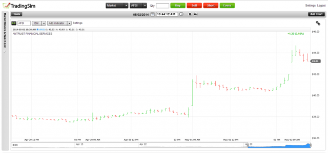
During the 70s and 80s, OHLC was the most popular charting method. It essentially provided you all of the key data points for a day’s trading activity. Once candlesticks arrived on the scene in the late 80s/early 90s, the technical gurus ate it up and the OHLC method became a thing of the past.
Now that we have covered the charting techniques, let’s shift our gears over to the actual layout of the chart itself.
X-Axis of a Chart
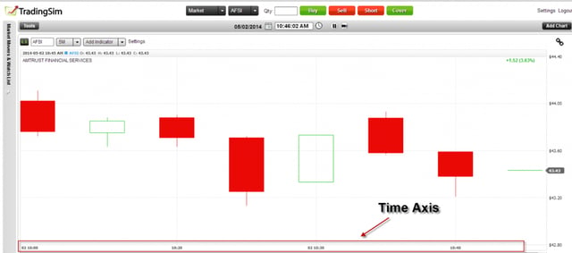
The x-axis on the stock chart is for time. As you go to the left on the x-axis you are going back in time. Depending on your timeframe, each marker on the x-axis could be ticks, minutes, days, months or years. It really comes down to your preferred view.
Y-Axis of a Chart
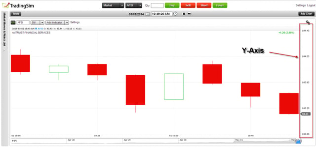
The Y-axis is where the price action is plotted on the chart. If you think about it, the concept of the y and x-axis is very similar to what you would have learned in middle school for how to find the slope of a line in a basic algebra class.
On-Chart Indicators
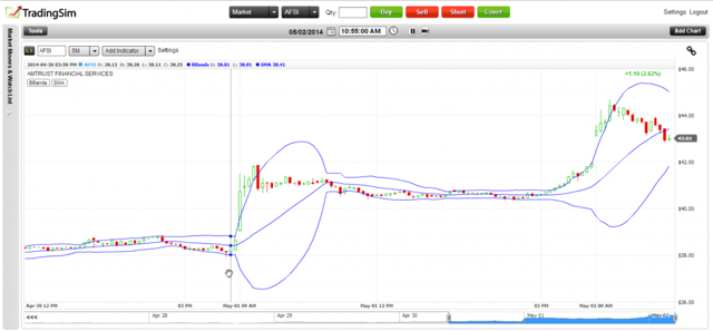
These are the indicators that you plot over the price chart. Some of the more popular indicators are simple moving averages and Bollinger Bands. The aim of these indicators is to provide confines to see how the price moves. For example, does the stock find support at the 200-day moving average?
While you may have the urge to place a million indicators on your chart, the key thing to note is that less is more.
Off-Chart Indicators
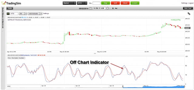
Off-chart indicators are used to calculate overbought and oversold levels for a stock. Examples of this are the slow stochastics and relative strength index (RSI).
Another example of an off-chart indicator, my personal favorite – volume. Volume is critical because it shows the relationship of supply and demand. Price action alone is simply not enough to make a judgment call on whether to buy or sell a stock. Knowing how many shares traded hands at key levels helps to identify the significance of key price areas.
Timeframes
The timeframe you choose will ultimately dictate your style of trading. Below are some basic guidelines:
Ticks to 30 minute – day trading
60 minute, daily and weekly – swing trading
Weekly and monthly – long-term investing
These are just rules of thumb, but as you can see, the shorter the timeframe the more active the trading. Figuring out what timeframe or style best suits your personality will be one of the first challenges you experience when starting your trading career.
Drawing Tools
Drawing tools are where you the technician can begin to formulate your own ideas around what to plot on the chart. The most popular drawing tool by far is the ability to draw lines.
The reason lines are so important is it allows you to draw boundaries that encapsulate the trading activity. Some stocks will have uptrend or downtrend channels, which when a stock hits extremes within these channels, you can use as an opportunity to make buy or sell decisions.
Another popular drawing tool are Fibonacci retracement levels. Fibonacci provides you the means to see how much a stock has retraced from a previous swing high or low. The most popular level is the .618% retracement which is a point where many traders look to make buying or selling decisions.
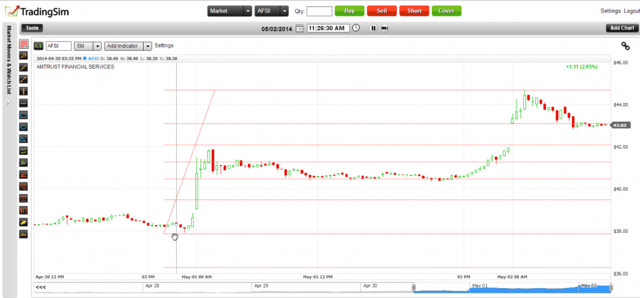
Tying it all Together
As you can see, there is a lot going on within a trading chart. The one thing I want to alarm you against is the need to overload your chart with indicators, drawing tools, and multiple timeframes. Information overload will make it virtually impossible for you to make a trading decision. Or worst, you end up going from one analysis effort to the next in hopes of finding the perfect trading solution to your profit troubles; it doesn’t exist. Your best bet is to stick to 1 or 2 timeframes, 2 off-chart indicators, and 2 on-chart indicators.
Using this sort of foundation will keep your chart “clean” which in-turn will provide you a clear head to make sound trading decisions.


 Trading Strategies
