Chart Patterns
A deep dive into the world of chart patterns and how to use them to your benefit during day trading.
.png?width=594&height=198&name=CHART%20PATTERNS%20TS%20(2).png)
How to Read Candlestick Patterns in Trading
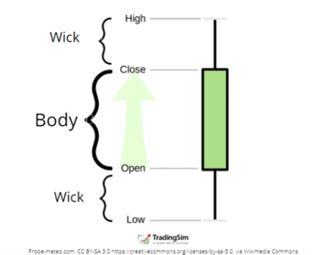
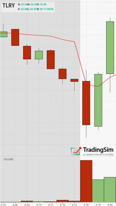
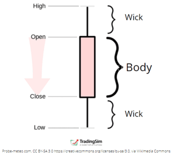
The value of candlesticks, which have been around for centuries, is in the story they tell. As you can see from the image above, a single candlestick shows the open, high, low, and close of the price action during that time interval.
To the naked eye, this might seem inconsequential. However, to the trained candlestick chart reader, all of that information is very, very useful in decision making. Here’s why.
Imagine a stock opens at $1 on a 1-minute candle but gets hit with a lot of selling pressure during the first quarter of the time interval. During the first 15 seconds, it trades below the opening price. This forms the lower wick of the candle.
Then, for the next 30 seconds, demand enters and the price of the stock moves higher to $1.50. It is safe to assume that bulls were able to overcome sellers during that time.
However, with 15 seconds remaining in the formation of the candle, selling pressure returns. This pushes the price of the stock back to $1.25, and forms the upper wick of the candle. Perhaps bulls took profits and bears re-entered the scene.
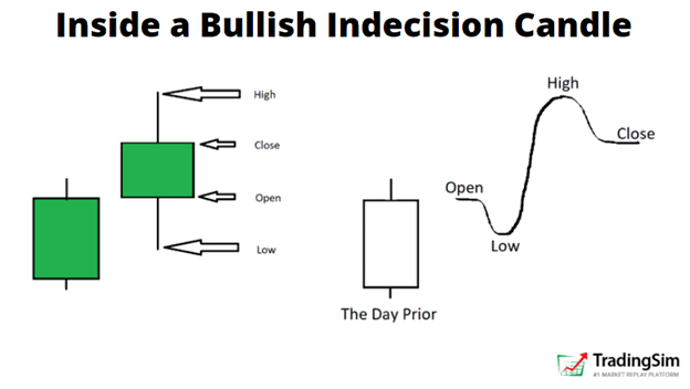
What is left is an indecision candle, which we’ll talk about later. It is a chart pattern that occurs over and over again.
Many implications can be had about this type of candle. It tells you that neither bears nor bulls are in full control. Regardless of the type of candle or implication, the point is that every candle has a story to tell. It’s also important that these chart patterns repeat, over and over again. It reveals a struggle between both forces in the market and where the stock could be headed next.
After all, it is the “hard right edge” of the chart we are always looking to anticipate. Chart patterns help us with this.
Types of Candlestick Patterns
Generally speaking, there are only three broad categories of candlestick patterns: bullish, bearish, or indecision patterns. Most of these patterns require the formation of more than one candlestick to create a pattern — and there are many such patterns.
In fact, entire books have been written about all the types of candlestick patterns you can see in the market. And while they are very informative and can add value to your trading decisions, the average trader may find the myriad of patterns daunting. For that reason, most educators try to condense the types of candlestick patterns into the most popular ones.
Here are a few examples of the most popular bullish and bearish candlestick pattern combinations that you might see. Perhaps you are already familiar with a few of them?
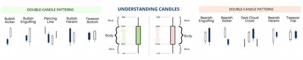
Types of candlestick chart patterns
Let’s dig a little deeper now into what constitutes a bullish or bearish candlestick pattern.
Bullish Candlestick Chart Patterns
A bullish candlestick pattern is one that implies a bullish character — simple enough, right? This could be a reversal of a downtrend or a continuation in an uptrend.
For a single candlestick, however, we assume it is a bullish candlestick when it “closes green”. What you’re looking for is a candle that closes higher than it opens, essentially. The example we gave above is similar.
Here’s what a bullish candlestick might look like:
Although this could be considered an indecision candle, the overall nature of the candle leans to the bullish side. It closed higher than it opened. There are plenty of other types of bullish candlesticks more bullish than this one.
For example, a marubozu candle occurs when price opens at the lows (no/small wick) and closes at the highs (no/small wick). We usually consider these very bullish candlesticks in that bulls were in control during the entire time interval.
Notice how strong the green, bullish reversal candle is on this chart. It was enough to overcome the entire red candle preceding it — and the wicks are super tiny. This tells us the demand was strong during the formation of the candle.
Bullish reversal candlestick chart pattern
For more examples like this one on bullish candlestick patterns, check out our guide to the 6 best bullish candlestick patterns.
Bearish Candlestick Chart Patterns
Contrary to bullish candlesticks, bearish candlestick patterns are just what you would assume. They reveal that bears were in control during the time interval that the candle pattern was formed. Likewise, they may represent a reversal pattern after a strong uptrend, or a continuation pattern during a downtrend.
For bearish candlesticks, we assume the price opens higher than it closes. In other words, bears took control at some point after the opening of the candle and pushed the price lower as the candle formed.
Here’s an example of what this might look like:
Beyond just candlesticks, there are many bearish candlestick combination patterns. These create a series of candles which produce a bearish “event,” per se. They could be parabolic reversals, tweezer tops, abandoned babies, evening stars, or other unique patterns.
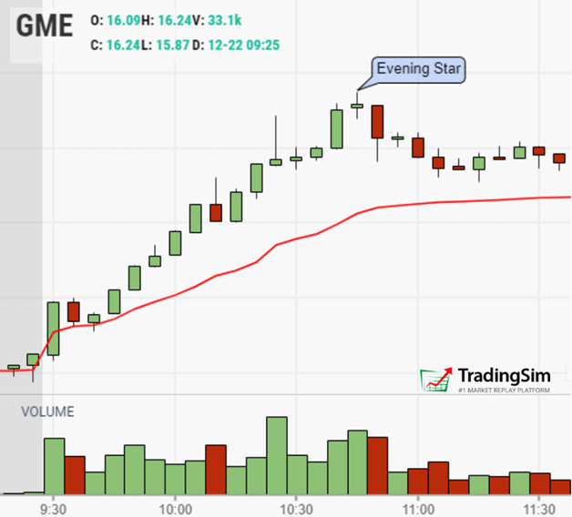
Evening star bearish candlestick pattern
Just like this example above, we discuss 8 of the most reliable bearish candlestick patterns in this tutorial.
Shooting Star Candlestick Chart Patterns
Continuing with some of the more popular candlestick chart patterns, let’s look at the shooting star candlestick pattern.
For good reason, most traders assume this is a bearish candlestick pattern. When taken in the context of an uptrend, the presence of a shooting star often signals a reversal. Many contrarian traders love to see these at the top of a parabolic run.
As price increases, what you want to see is a large volume candle that starts low, goes up, and then comes back down to where it started. It leaves a nice long topping tail. This tells us that gravity, just like with a real shooting star, is pulling the price of the stock back to earth.
Traders look for these so that they can then take a short position and risk off the high of the candle, assuming it won’t go any higher.
Here’s an example of what that trade might look like:
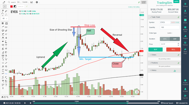
Shooting star candlestick pattern trading example
Just as you’d expect, the shooting star occurs at the end of an uptrend, giving you an opportunity to short the stock, expecting a reversal. After the shooting star candle is formed, you initiate a short position on the break lower, risking the high of the shooting star candle.
We discuss how to trade this setup more in-depth in this tutorial.
Hammer Candlestick Patterns
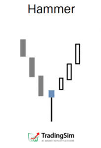
Hammer candlestick patterns are somewhat similar to shooting stars in that they often signal reversals. In fact, they can be bullish or bearish depending on the context.
As you can see, a hammer candlestick pattern often signals a reversal of a downtrend, much like a shooting star does on the opposite end of a trend. Both hammers and shooting star candles look the same, don’t they?
In the Hammer candlestick pattern example, we have sellers capitulating into stronger hands who buy up their shares. This leaves a long bottoming wick, and signals a reversal. To take this trade, you simply buy the breakout above the hammer candle after it is formed, risking to the low of the wick.
Inverted hammer patterns can also signal reversal in a downtrend. It simply means that sellers were not able to continue pushing the stock price lower. Once they realize this, they give up and begin covering their positions, pushing the price higher.
For more on how to trade hammer candlestick patterns, check out this guide.
Doji Candlestick Patterns
Doji candlesticks are often referred to as indecision candles. They can show up red or green on a chart, but aren’t exactly considered bullish or bearish. They typically indicate a stalemate between both forces.
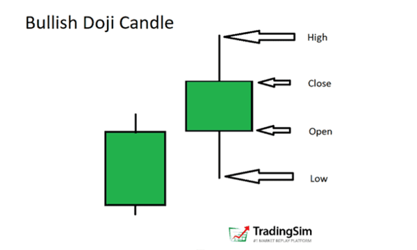
Like the example above, what you typically find in a doji candlestick is a very narrow body with wicks on either end. Similar to what we discussed above, this informs the chart reader that both bears and bulls created a tug-of-war while this candle was forming, and neither really won, despite the candle closing green or red.
However, if you spot the doji candlestick pattern in certain contexts, it might signal a reversal. We discuss this in our tutorial on dojis. Here are a few examples of where you might see doji candlesticks, and how they differ from the large marubozo style of candlestick patterns:
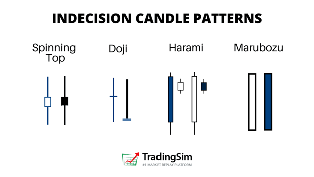
Comparably, doji candles are narrow-bodied with long wicks. Ideally, you’ll want to wait until the next candle forms after a doji to make a decision as to who has the upper hand - bull or bears. This will keep you safe in your trading decisions.
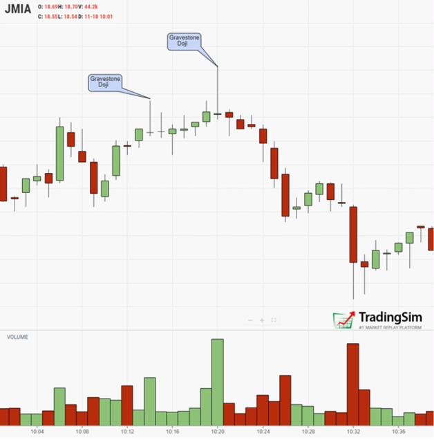
Here is an example of a gravestone doji reversal pattern:

Candlestick Patterns Cheat Sheet
In order to keep from getting overwhelmed, we created a cheat sheet for you of the most popular candlestick patterns. Ideally, you’ll keep this handy while you’re trading in order to train your chart eye.
Over time, you should expect to recognize these patterns instead of having to refer back to the candlestick pattern cheat sheet. As you see a stock becoming more and more extended, it will become second nature to you to start spotting these patterns.
Feel free to save this for your own trading purposes:
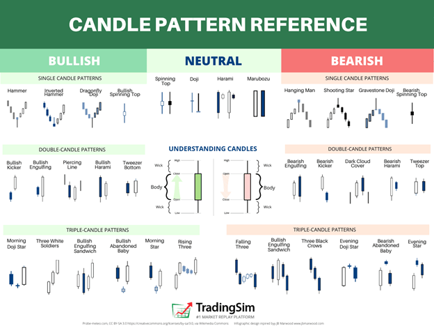
We’ve broken the most popular patterns into bullish and bearish candlestick patterns in this cheat sheet. We recommend taking the following approach to learning these:
- Pick a side (bullish or bearish)
- Focus on 2-3 candlestick patterns for 2-3 months
- Identify all the examples you can find of those patterns
- Document what makes the pattern work or fail
- Create a list of criteria you can use to stay disciplined as you trade the setups
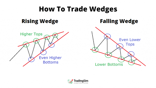
What is a Triangle Pattern?
Triangle patterns are a collective of candles that form a general chart pattern over time in the formation of a triangle. They can be ascending triangles, descending triangles, or symmetrical triangles.
For all intents and purposes, the simple way to spot one of these is to draw a trend line across the top and bottom of the most recent price action of the stock in play. If you find that stock coiling into an apex, it is likely forming a triangle pattern.
These can be called by different names. Some like to call them pennants, others like to call them wedges. Aside from maybe a few nuances here or there, they are all basically the same — chart patterns that resembles a triangle.
Descending Triangle Patterns
The descending triangle pattern is one of the most recognizable chart patterns in trading. It usually forms as a reversal at the end of a downtrend or as a continuation pattern in an uptrend. It offers a chance for bulls to reload after profit-taking in a stock.
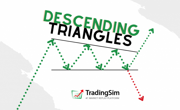
Often labeled a descending wedge, it is important to note that the stock can resolve in either direction, up or down. For that reason, it’s always best to respect your stops. However, it is generally assumed to be a bullish pattern.
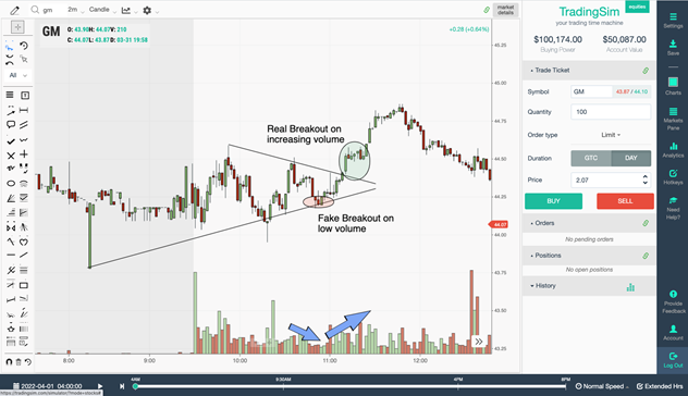
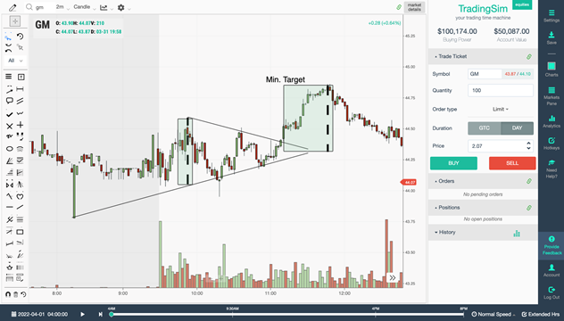
In our tutorial on descending triangles, we teach you a handful of ways to trade this pattern. One of the most popular is the breakout strategy. In this strategy, you wait for the stock to put in a series of volatility contractions, then buy on the breakout of the upper trend line.
As shown in the example above, you’ll want to measure the broadest part of the triangle, and then set that as your target distance once you overlay from the point of breakout. Your stop would be below the most recent low of the pattern.
Ascending Triangle Pattern
Ascending triangle patterns can also resolve in either direction. Just like its descending counterpart, you always want to respect your stops if you are wrong on the trade. However, ascending triangle patterns are generally accepted as a bearish pattern.
Ideally, what you will want to see is a series of higher lows forming in the stock. In order to take a bearish stance, we recommend looking for elevated selling pressure as the stock makes new highs in the formation.
Once the stock reaches its apex and selling has done its job, look for a breakdown entry through a signal line or lower trend line.
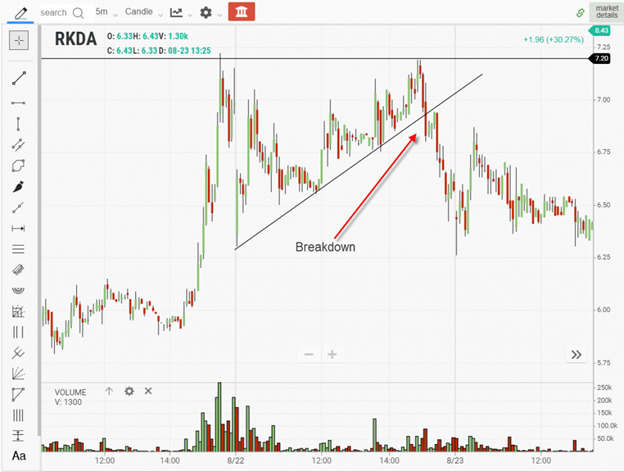
In the example above, notice how as the stock advances, selling pressure prevents it from putting in a new high. It’s akin to “walking the plank.” The end result is inevitable, it just takes a little time to get to the end of the plank.
For entries, take your position on the breakdown, risking the highs. Targets can be set at the lows of the structure, or by measuring the broad part of the triangle and applying it to your breakout point.
Symmetrical Triangle Patterns
Symmetrical triangle patterns are a lot like pennants. As the structure forms, you expect to see higher lows and lower highs. This contracts into an apex formation. However, unlike the ascending or descending triangles, it may be a bit harder to predict the direction of least resistance at first. Sometimes they can seem a bit 50/50 in nature.
Similar to the volatility contraction pattern we discuss in our best small account strategy, it can lead to big gains under the right circumstances. Here are a few chart examples of what to look for in a symmetrical triangle pattern.
In this example, we have a false breakdown. As you can see, it is sometimes difficult to judge such a tight pattern. However, as the pattern evolved and reclaimed, you could flip your bias and risk off the most recent low for a long trade.
Here’s an example of managing your risk and setting your targets for the symmetrical triangle pattern:
In this example, we measure the widest part of the triangle and apply it to our breakout in order to set our 1st target zone.
For more advanced early entry techniques, take a look at our explanation of VDU and Pocket Pivots for this strategy.
What is a W Pattern / Double Bottom?
The W pattern is a consolidation pattern where a stock essentially retests a support area twice. Hence the "double bottom" name associate with the pattern. Usually, you'll find this pattern as a pause in an uptrend, or as a bottoming pattern in a downtrend.
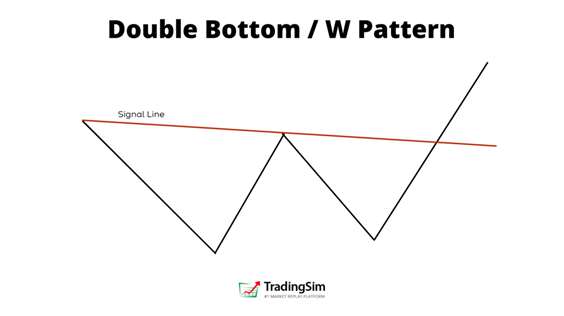
The double bottom signals to potential traders that the stock is having a hard time making new lows. As a result, long-biased traders may take advantage of the opportunity by buying the stock and risking off the support of the "W".
It's also fair to mention that if you are familiar with the double top pattern, this is essentially the mirror image of that strategy. We discuss this strategy in depth in our tutorial here.
Trading the Bullish W Pattern / Double Bottom Chart Pattern
For obvious reasons, the double bottom is considered a bullish chart pattern. There are never 100% certainties in the markets, however. And that is why it is always best to implement stops, and respect them!
Let's look at an example of where you could enter a bullish double bottom pattern in this chart of PLTR recently.
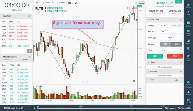
Notice how the stock has a sharp pullback into the 12:00pm hour. Like we mentioned above, we want to see volume increase as the stock pulls back into the first trough of the W pattern. This example didn't let us down. We got a nice long bottoming wick and elevated volume in the first trough of the "W".
Then, as the stock forms the second trough, we get a slight increase in volume again along the lows. Only this time, less selling pressure enters the market than the first time. As supply dries up, we see the stock rocket away from this demand zone. The second pullback was a classic retest of the support in the first trough.
Our first entry could be on the diagonal trend line drawn across the top of the bullish double bottom pattern.
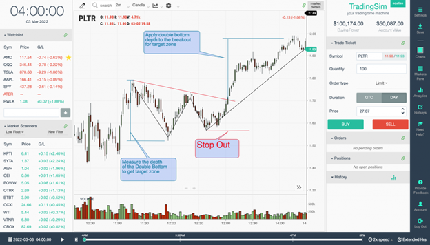
Once you enter the stock, make sure your trade plan includes a proper stop. In this case, we put our stop below the most recent W pattern trough. Then, we measure the depth of the W and apply that to our breakout entry to get a potential target.
In this example we reached our target of $12. A $0.30 correction gave us a $0.30 profit, with only $0.13 risk from our entry. Not bad!
Bearish W Chart Pattern / Double Bottom
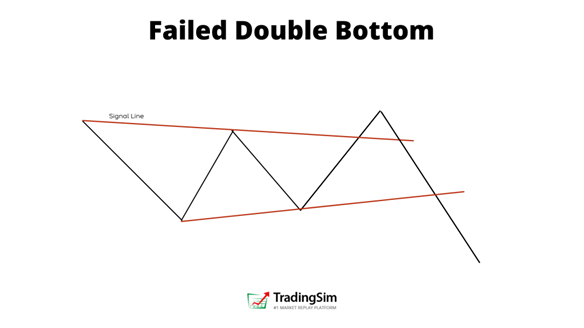
There really isn't a "bearish" double bottom, per se. There is only a failed doubled bottom. Unless, of course, you want to play the bearish counterpart to the double bottom pattern, which is the double top.
Failed double bottoms typically look like bear flags. The W turns into an "M", in other words, and kind of looks like this:
On the other hand, if you're looking for a topping pattern, the double top is a great strategy to add to your arsenal. Much like the double bottom, a bearish double topping pattern fails after a retest of the highs. Ideally, you'll take the trade short on the break of the signal line, setting your stop at the high of top #2.
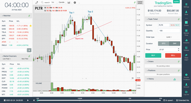
This is another example from PLTR. As the stock runs up, it is clear that selling pressure is present given the number of wicks on the candles. After the first sign of weakness, PLTR makes a failed attempt to set new highs in Top 2. This traps breakout buyers and then the bid is pulled. The path of least resistance is obviously downward from then on.
Like our double bottom pattern, we would initiate a position on the break of the red signal line, set our stop at the highs, and measure the move for a potential target zone.
More can be found on this setup in our W pattern guide found here.
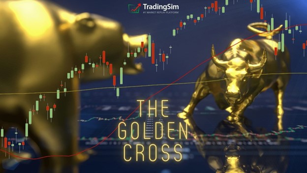
Golden Cross Chart Patterns
The golden cross is a bit unlike some of the chart patterns we've already mentioned in that it requires two moving averages. In fact, you could almost trade without candles using this chart pattern, though we don't recommend doing that.
How to Read the Golden Cross in Stock Trading?
In order for a golden cross to occur, the 50ma must -- obviously -- be trading below the 200 moving average. To that end, you expect to see this happening in the context of a downtrend. Price is trading lower than it was 200 days ago. And along those lines, the faster 50ma will be below that longer time frame average.
When the cross occurs, it signals to investors that momentum could be shifting. Couple this with other chart patterns like the double bottom we mention above, and you may find even more confirmation for your strategy.
Ideally, you'd like to see the speed of upward movement on the shorter time frame overtaking the longer time frame's rate of change. When this occurs, it may be time to buy.
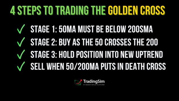
That being said, there are three stages of a golden cross that you should understand.
Three Stages of a Golden Cross Stock
Stage 1
In stage 1 of a golden cross, we have a downtrend. On a chart, you'll want to see your 200 moving average trending clearly downward, along with the 50 moving average. However, the 200 moving average needs to be above the 50ma on the chart.
Here is an example with AMC. AMC was in a clear downtrend before all the hype about the squeeze occurred in 2020/2021. Before the cross occurs, we would consider this stage 1. In Wyckoff's methodology, the downtrend is losing steam during this stage and preparing for a potential reversal of a trend.
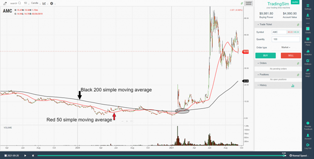
As you can see, we have the 200 simple moving average in black trading above the red 50 simple moving average. However, if you pay close attention to the chart, you'll notice that AMC began to slow its downward progression and tested a "cross" before the real golden cross occurred in early 2021. This is stage 1 of a golden cross stock.
Stage 2
This is the crossover stage. Once a stock recovers from the downtrend, puts in a consolidation and gives institutions time to accumulate shares, it is time to mark the price of the stock up again! As part of this process, the trending 50 and 200ma will eventually cross as the new uptrend begins.
Here are those stages again using AMC as our chart pattern:
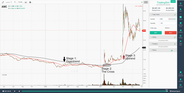
Notice that AMC rockets higher in price before the golden cross occurs. This send the faster moving 50ma closer and closer to the 200ma.
In our circled annotation on the chart, you would have actually got a very nice buyable pullback if purchasing based upon this strategy. The launch was enough to make the cross, and the pullback gave you a great entry. Once the stock made a golden cross, it really never looked back before launching yet again in June of 2021.
Stage 3
Stage 3 is the new uptrend phase of the golden cross stock pattern. Once the 50 moving average is trending above the 200 moving average, you expect it to remain that way for some time. Take for instance this example of a golden cross in TSLA:
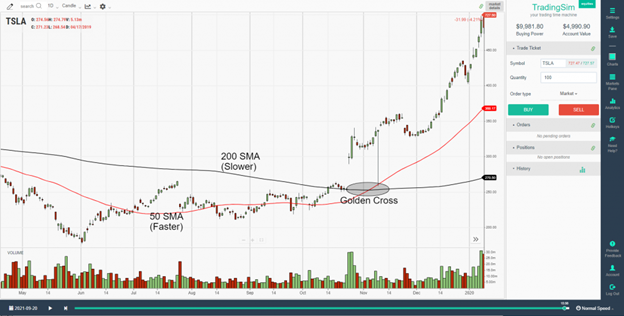
TSLA's golden cross in 2019 lasted until July of 2021 and resulted in an over 1000% increase in price by the time the 50ma crossed back below the 200ma. That's a massive gain! Obviously, this won't happen all the time, but it goes to show that a solid trending environment with a strong stock can create a really lucrative golden cross pattern.
That being said, the golden cross strategy lasts only as long as the 50ma crosses above and stays above the 200ma. For this reason, you may get false signals in the early stages of the new uptrend, or along the way depending on how strong the uptrend is.
Golden Cross Cheat Sheet Signals
Although the golden cross pattern is pretty straight forward, here are a few examples for you to use as a cheat sheet when trading.
You need to know that the opposite pattern of the golden cross is the death cross. In an uptrend, the 50 moving average crossing below the 200 moving average is a signal to longer term traders that the trend might be changing in the opposite (bearish) direction. It becomes your sell signal.
Here is an example of using this strategy to complete your golden cross trade:
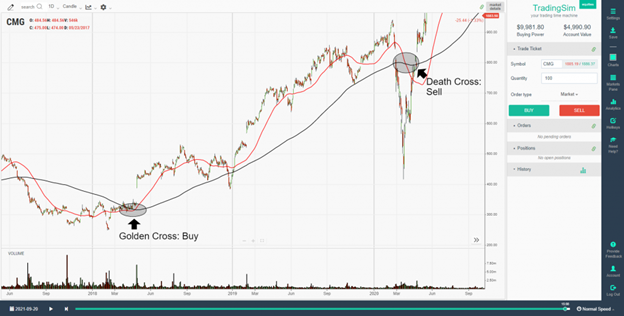
Although you wouldn't have timed the top of CMG in this example, it is clear that you would have gotten the "meat of the move" from the original buy signal. Hopefully it is clear that a solid trending environment works best for this chart pattern.
There are some caveats and other ways to manage your position, like trendline breaks, or selling at prior resistance levels. However, if you want to stay true to the trend following strategy, you'll buy on the golden cross and sell on the death cross.
For more information on trading this strategy, be sure to read our in-depth post on golden crosses.
Bear Trap Example 1
The first example is a failed breakdown of stock SOLY. This stock was a lower float, lower-priced stock that had run up considerably intraday. After chopping around on heavy volume mid-day, we saw a huge kill candle form. This was an ideal 1-3 pm Bloodbath setup, but as you can see, the stock selling pressure was absorbed.
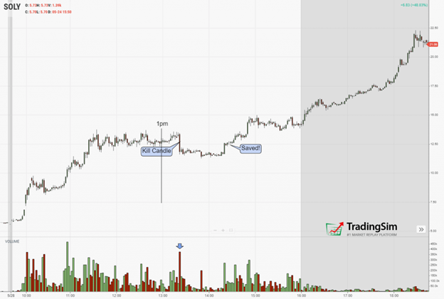
As SOLY began trading lower than the 11-1:30pm trading range, it retested the underside of that key level. From that point, the stock reclaimed the trading range and never looked back. In other words, bulls saved the stock and trapped the bears. The rest of the day, bears did their best to mitigate their losses by covering and fueling the stock price higher.
To trade this, you want to set a trendline at the lows of the trading range that broke down. IF the stock reclaims 50% of the kill candle, take your long position and risk to the most recent lows.
Bear Trap Example 3
Oftentimes, if you can combine multiple strategies, it will help your odds of success.
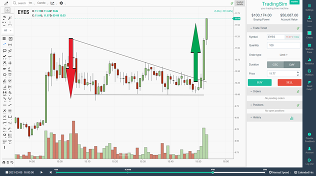
In this 30m chart of EYES, we see a bear trap combined with a hammer candlestick pattern. This gives us clear evidence of an impending reversal after a failed breakdown.
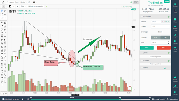
Bear Trap and Price Action Trading
Not only do we get a hammer candle reversal, but it comes on the heels of a descending triangle pattern as well. What better way to combine as many chart patterns as possible in order to create your trade thesis. And that's exactly what you should be doing. Combining chart patterns and elements of trading together only increases your chances of success.
If you'd like to learn more about the bear trap stocks pattern, please visit our detailed tutorial here.
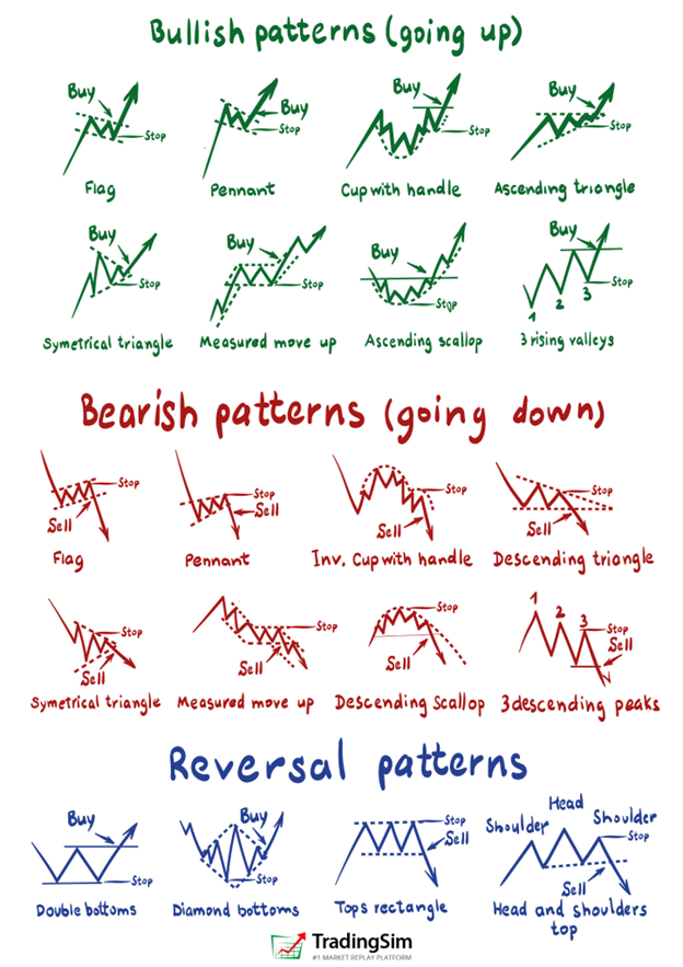
Chart Patterns
Summary and Cheat Sheet
As you can see, there are many different types of chart patterns in the stock market. We recommend taking your time while educating yourself with many of the resources we've listed here. Keep in mind that successful trading is a marathon, not a sprint.
Not all chart patterns will work for you. For that reason, we always preach risk management. Learn to be wrong when the market doesn't go your way. It will save you the headache and heartache of big drawdowns in your account.
For more information on chart patterns, check out many of the resources here at TradingSim.com. Also, be sure to sign up for our 7-day free trial and practice these chart patterns in the simulator with no risk! We'll leave you with this chart patterns cheat sheet of many of the more popular chart patterns.
chart patterns cheat sheet