Balance of Power
Don Worden created the balance of power (BOP) indicator in the 1950’s to understand market activity between buyers and sellers.
Below is a chart of Goldman Sachs Group Inc. (NYSE:GS) with the balance of power indicator displayed below the price action.
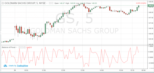
balance of power
Now, let’s see how the BOP is calculated.
Balance of Power = (Close price – Open price) / (High price – Low price)
Signals generated from Balance of Power Indicator
BOP is plotted above and below a zero line.
Ok, now you must be thinking that this indicator is similar to an oscillator.
No, you are wrong! It is not an oscillator. It does not swing up and down with the price. It goes its own way, quite independent against the price movement.
So how do we read the balance of power indicator?
When BOP is above the zero line, it is showing systematic buying.
When it is below the line, it is indicating systematic selling.
The key challenge when using the BOP is the identification of when a stock or market is trending.
Below is the five-minute chart of Apple from July 1st and July 5th, 2016. On the chart, we have highlighted the buy and sell signals as provided by the BOP.
You can see that during the initial hours of trading there is huge buying activity on July 1st, 2016. However, the BOP indicator is showing heavy selling activity from the mid-session of July 1st, which leads to the sell off on July 5th.
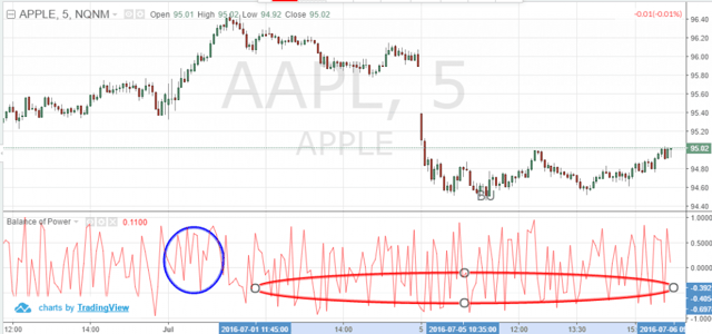
Balance of Power Trade Signals
The next day, Apple began falling the morning of July 6th, while the BOP started showing a strong buy trend from the prior session.
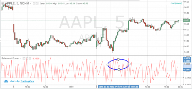
Balance of Power Trade Signals_2
As you see in the above chart, Apple prices continued to fall in the last hour on July 5th, while the weak momentum continued in the initial hour of trading the next day.
Despite the conflict in price and BOP, the buying momentum came in on July 6th.
So now the real task ahead for us is how do we identify these bullish or bearish trends from the balance of power indicator?
Also, how do we know when a new trend is real or if it’s just a fake out?
For this we need to understand the divergences between price and the BOP in order to identify a potential trend reversal or ongoing trend continuation.
We identify these divergences based on two types– regular and hidden.
Regular Divergence
Regular divergences indicate a signal trend reversal, while hidden divergences indicate ongoing trend continuation. Let’s understand these divergences in detail!
Regular Bullish Divergence
A regular bullish divergence is when the market forms lower lows, while the BOP forms higher lows.
For the below Microsoft chart on July 6th, 2016, we see that the stock fell during the initial hour and traded near the daily lows for an hour after the open.
At the same time, you see that the BOP was also forming new lows. This is a bullish divergence signal indicating that the stock would rise. Accordingly, Microsoft prices started rising at 10:50am through the rest of the day.
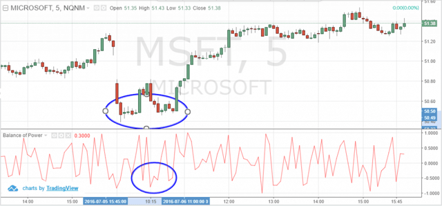
Regular Bullish Divergence
Regular Bearish Divergence
A regular bearish divergence is when the market forms higher highs, while the BOP forms lower highs.
For the same Microsoft chart from July 1st, 2016, you can see that the markets opened with a gap and formed a high within the first hour of trading.
However, the balance of power indicator made lower highs while the price was consolidating, indicating a bearish divergence. Consequently, Microsoft began falling the rest of the day.
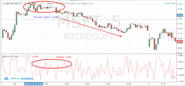
Regular Bearish Divergence
Hidden Bullish Divergence
A hidden bullish divergence occurs when the market forms higher lows, while the BOP formed lower lows. You can see this pattern in the below five minute Alcoa chart from July 6th, 2016.
The stock has been volatile in the initial hours of trading and formed a low. For the same time frame you see that the BOP formed a lower low, as highlighted in the blue elliptical. From around 10:50 am, you see that the stock began recovering and closed on a positive note at the end of the day.
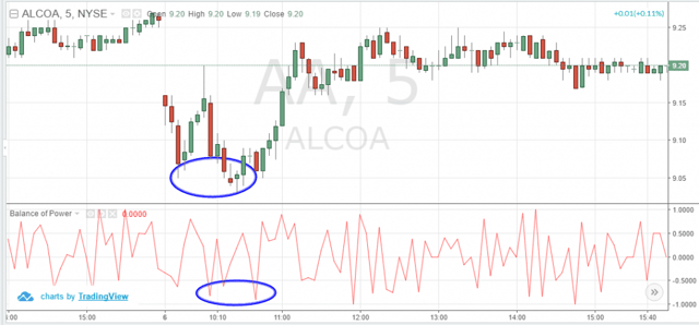
Hidden Bullish Divergence
Hidden Bearish Divergence
A hidden bearish divergence is when the market forms lower highs, while the BOP forms higher highs. To see this trend, let’s take the five-minute chart of Ford Motors on July 5th, 2016.
You see that prices are in a bearish trend for the day. This trend is confirmed by the BOP indicator which formed a higher high for the day. You can see in the chart that prices continued to fall for the rest of the day after the development of the bearish divergence.
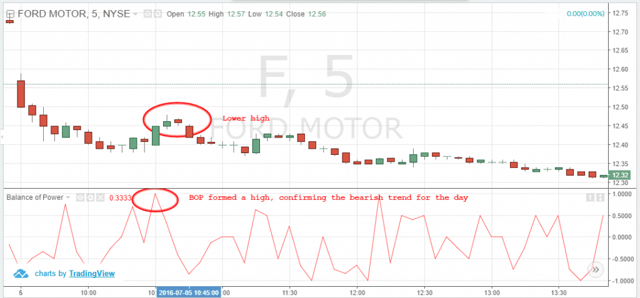
Hidden Bearish Divergence
Weaknesses/Cons of the balance of power indicator
Like any other indicator, the BOP has its own shortcomings. In fact, more cons, in my view.
The BOP tracks the activity between buyers and sellers and hence brings out the hidden patterns of accumulation or distribution. However, even expert buyers and sellers could be wrong about future price trends.
Also, the BOP offers an inside glimpse of informed accumulation or distribution, but that does not mean you should open a long or short position on every signal provided.
Moreover, the BOP indicator is not very accurate when identifying a trend.
Lastly, even though the balance of power provides bullish and bearish divergence signals, the indicator could quickly reverse after entering a trade.
You can see this behavior of the indicator in the charts above, where you have misleading or contradictory signals from the BOP indicator when trying to confirm a trend.
Intraday traders could avoid these false signals from the BOP by combining this indicator with other preferred indicators.
Conclusion
- The balance of power indicator can be used to understand the buyers and sellers pattern as the prices rise or fall depending on the systematic buying (accumulation) or systematic selling (distribution) by the traders
- BOP is not similar to an oscillator even though it is plotted above and below a zero line. The indicator is not impacted by the price movement.
- BOP indicates that there has been a systematic buying in the stock when it is plotted above the zero line. On the contrary, BOP signals systematic selling when it is plotted below the zero line.
- Balance of power could indicate the potential trend reversal or confirm an on-going trend based on two types of divergences- Hidden and regular.
- However, balance of power could not be used as a primary indicator to identify trends. The indicator generates many misleading signals and hence we believe that traders need to use the BOP indicator as an add on
- Traders can watch the clustered tops or bottoms from the balance of power indicator to support their positions.
- Day traders need to understand the historical success rate of the balance of power indicator for that particular stock. If the BOP signals identify trends with a good success rate, then traders can pay closer attention to signals provided by the indicator.


 Volume Indicators
