Story Highlights
What is the average true range indicator?
The average true range indicator is an oscillator, meaning the ATR will oscillate between peaks and valleys. [1]
The ATR has no upper or lower limit bounds like the RSI or slow stochastics. The other element of the ATR is the indicator is based on the price performance of the stock in question. Therefore, Apple may have an ATR of 15, while Baidu may have an ATR of 38. However, Apple could be more volatile even with a lower ATR value.
This lack of consistency makes the ATR a favorite in my trading toolkit. This is because it requires the technical analyst to assess the stock’s volatility on a case-by-case basis and not make general assumptions.
Average True Range Formula
Let us quickly cover the average true range formula [2], so we can focus on how to use the ATR.
The ATR formula is comprised of three key inputs, which is why the word “true” is in the title because these three inputs provide a more holistic view of a stock’s trading activity.
How to Calculate the Average True Range
Input 1 – Current Day’s Range
Current High – Current Low
$75 – $70= $5
Input 2 – How High has the security risen from the previous day’s close
Absolute Value (Current High – Previous Close)
($75 – $80) = 5
Input 3 – How low has the security dropped from the previous day’s close
Absolute Value (Current Low – Previous Close)
($70 – $80) = 10
The highest value of the three inputs is the ATR, so in the above example, 10 is the ATR.
In order to calculate the average true range, you take the average of each true range value over a fixed period of time. For example, when calculating the average true range for a 14-day period you would take the average of the true ranges over 14-days.
For more information on average true range calculators, excel formulas and history, below are a list of great sources:
Excel Calculator
Average True Range Excel Example – Invest Excel (You will need to scroll down near the bottom of the article to locate the download spreadsheet link)
To uncover the history and origins of the Average True Range you will want to read the book by the ATR creator, J.Welles Wilder – titled ‘New Concepts in Technical Analysis’. [3]
Average True Range Chart
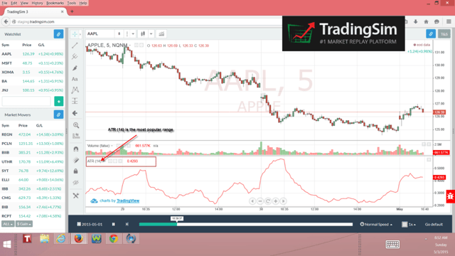
Average True Range of Apple on a 5-minute chart
The average true range is an off-chart indicator, meaning you will plot the indicator above or below the price chart. For me, I prefer to have the average true range below both the price chart and volume indicator.
As you can see from the above chart example of Apple, the average true range moves lockstep with the price action shifts from highs to lows.
The one key differential for the average true range is that the indicator will experience extreme highs and lows based on the volatility independent of price direction. Remember, the ATR is an absolute value, so you can have a high ATR while the stock price is plummeting.
How to Use the Average True Range Indicator
The average true range indicator is a volatility measure of a stock’s performance. Below are the key ways traders use the indicator:
- Gauging a stock’s volatility
- Stop Loss/Exiting a Trade
Gauging a stock’s volatility
One of the greatest challenges for new traders is avoiding drawdowns on their account. Drawdowns are what kills a trader’s ability to consistently earn over the long haul and creates enormous emotional pain and turmoil.
Drawdowns are a result of two factors: (1) over-leverage and (2) extremely volatile stocks. One could argue that if you get number 1 right, the volatility is irrelevant; however, these two elements are not always mutually exclusive.
Early on in my trading career, I would have the standard rule of I only want to use “x” amount of dollars or risk “x” amount of dollars per trade. The challenge I would face after entering the position is that the stock would move wildly in one direction or another in ways that I either did not anticipate or were not accustomed.
I Needed a Consistent Method
I quickly realized I needed a method for identifying great setups and a stock’s volatility.
To this aim, I began researching the average true range indicator.
The problem I had with the average true range is that the indicator’s value was different for each stock. Higher priced stocks had higher ATRs versus the low priced momentum players.
In order to find a universal method for assessing the risk, I divided the ATR by the stock price to establish a ratio of the range relative to the stock’s price. Using the above chart example, take the 14-period ATR divided by the closing price of Apple on the 5-minute chart (.42/$126.39) = .0033.
On the surface, this .0033 means absolutely nothing. Now, let us apply the same math to a more volatile stock.
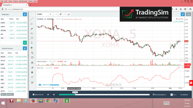
ATR XOMA Chart
XOMA has a stock price of $3.15 with an ATR of .04 which gives us a volatility ratio of (.04/$3.15) = .0126. .0126 is 3.84 times greater than .0033, which is the volatility ratio for Apple on the same 5-minute time frame. Therefore, a trader would need to give XOMA more wiggle room as the stock is likely to have greater percentage moves up and down.
Now that we’ve mastered basic arithmetic, let’s walk through how to apply this to your trading regimen.
As you begin to analyze the volatility ratio of stocks, you will begin to identify the stocks that have just the right mix of volatility for your trading appetite. Meaning, over time you will identify the right mix of volatility that gives you the returns you want with just the right amount risk.
Find an ATR Range that Works for You
For you, your volatility range could be .012 – .02. Alternatively, you could be more conservative and trade stocks with a volatility ratio of .0025 – .0050 on a 5-minute scale.
The key thing to remember when determining which volatility ratio works best for your trading style is to stick to one-time frame. You cannot compare the 5-minute ratio to a daily value, even for the same stock. The common thread is the timeframe; otherwise, you are comparing apples to oranges.
Stop Loss/Exiting a Trade
The key to making money is buying a stock for less than what you sell it for. This is a basic concept, but easier said than done.
When attempting to identify a great entry point, a key indicator that a stock is likely in the process of going counter to the primary trend is a drop off in volatility. In theory, this equates to diminishing price movement, which implies that either the buying or the selling interest is tapering.
Knowing When to Exit
So, how do we use the ATR indicator as an early sign that the stock is likely going to have a change in trend, so we know where to execute a stop loss to exit a trade?
For newbie traders, this explanation will get a bit muddy, but do the best you can to stay with me.
The below chart is of Apple from the time period of late April through early May. Apple had a nice run up from $125 through $134, only to retreat down through $125.
Looking at the ATR, do you have an idea of where to place the average true range stop loss?
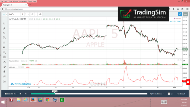
ATR Apple Example
In simple terms, you will apply a multiplier to the ATR value to determine your profit and stop loss values. The key, of course, is making sure your multiplier for the target price is greater than the stop loss, so over a series of trades, you have a greater likelihood of turning a profit.
In the Apple example above you would take the ATR value of .29 and then apply for example a 3x multiplier for your target and 1x for your average true range stop. This would provide you a target price of (.29 *3) + $126.47 = $127.34. Conversely, the average true range stop loss for this trade would be $125.60.
On paper, this makes a lot of sense. For every dollar you risk, you can make up to 3 times in profits. Following this model, you could have more losing trades than winners and still be in the black.
No Indicator is Perfect
However, as I evaluate the use of applying this average true range ATR indicator exit strategy, I see a number of flaws.
For starters, applying a multiplier to the average true range during a dull trading period will limit you in the potential gains as your profit targets are relative to the most recent trading volatility.
In terms of stop loss, if a stock is in a whipsaw-trading period, then you will likely be stopped out due to the tight price action.
If you only use the ATR to determine when to get in and out of trades wouldn’t life be grand? In reality, you will need additional confirmation for what the ATR is telling you and what better confirmation than price?
How to Use the Average True Range for short-term trading
Using the ATR to assess the price movement is a much better usage of the ATR. Having the ATR act as a profit target and stop loss mechanism is asking too much of the indicator.
Let’s take another look at the 5-minute Apple chart when we combine both the ATR and price channels.
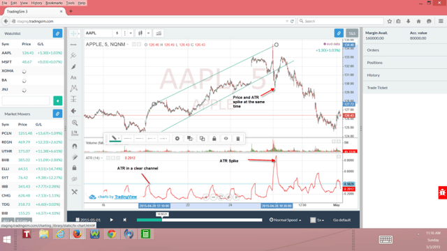
Price and Average True Range Spike
The same way stock prices will trade in clear trends, so can indicators such as the ATR. Notice in the intraday chart of Apple, both the ATR and stock price were in channels of sorts. The ATR was in a horizontal channel with low volatility, while Apple stayed in a clearly defined uptrend.
This combination of low volatility combined with a clear uptrend let’s you the trader know that the up move is measured and can be traded with high confidence.
Then just as the market lulls you to sleep, volatility will rear its ugly head to ruin the parade.
You Need More Than Just the ATR
Again, the ATR is not a standalone indicator for determining stop loss or profit targets when trading. However, one cannot deny the power of combining the ATR with price action to identify a likely change in trend.
Notice how the ATR and price both spike at the same time in the Apple chart. More importantly, notice how the price spikes right through the support line.
In every other touchpoint of the support line within the channel, the ATR remained in its tight horizontal trading range. The violent break and ATR spike should set off alarms that easy money was no longer available.
Apple managed to muster up one last push higher before the stock had a swift sell-off taking the stock back to the starting point of the preceding rally.
Someone could make the argument that of course, Apple reversed; you could see how quickly the price moved down…no brainer. Well, yes and no. By having the pulse of Apple’s volatility over the preceding weeks, you could see the magnitude of the move in terms of volatility that is otherwise unclear by only reviewing the price chart.
In Summary
The ATR is a powerful tool, which I use in both my day trading and swing trading activities. Remember the real power of the ATR is its ability to judge the “frenzy” and the “calm” in a security.
To quickly recap, below are the key takeaways from this article:
- Use the ATR to gauge the risk of a trade prior to entering the position. If you like the slowness of IBM, you should not trade a $3 dollar biotech.
- Do not use the ATR for placing stops and profit targets. Again, if you use the ATR to create a profit target right before a massive breakout, you will likely gain a fraction of the true profit potential.
To further explore the ATR, please test-drive your theories using the #1 Market Replay Tool – Tradingsim.com. In addition to the ATR, we have a host of other technical indicators and studies, which you can practice using in a stress-free environment with real historical tick data to see what works best for your trading style.
Good Luck Trading,
Al
External References
- Bhandari, Bramesh. (2017). Trading the Average True Range. futuresmag.com
- Wilder, J. Welles. (1978). New Concepts in Technical Analysis. Hunter Publishing Company
- Average True Range. Wikipedia


 Day Trading Indicators
